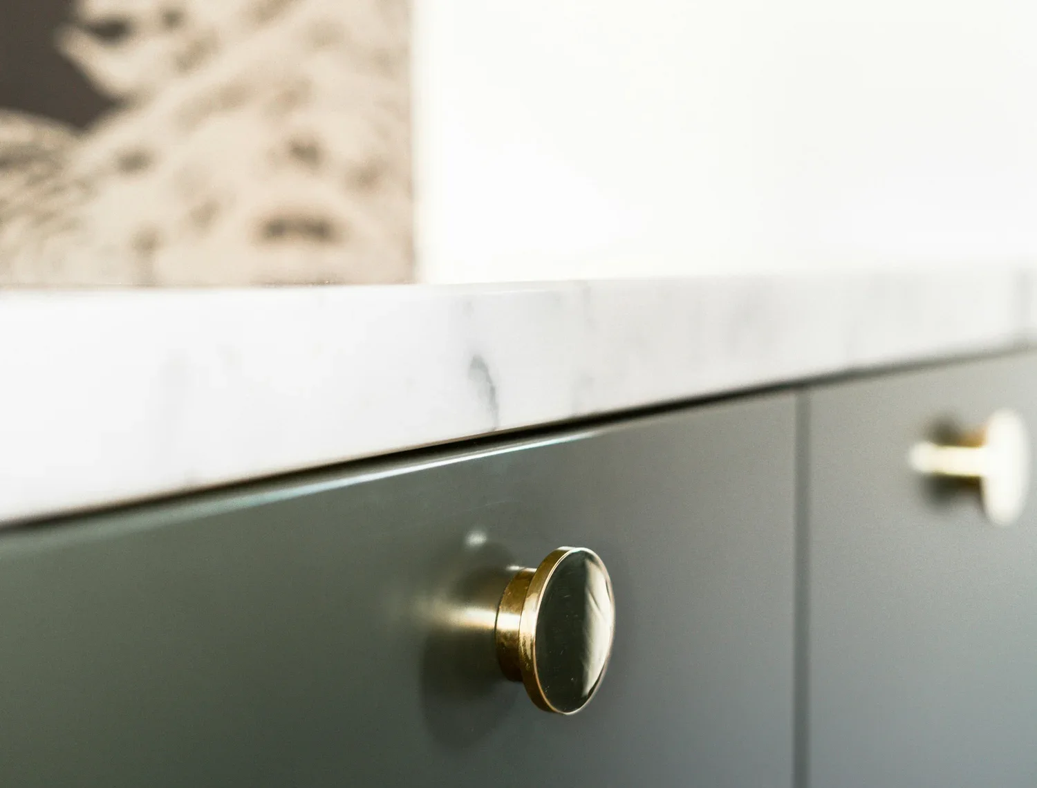
The safest kitchen colour is not white. It is the colour you have tested with every permanent material in the actual room.
A cabinet sample can change beside timber flooring, a warm benchtop, stainless appliances or cool daylight. That is why a colour name or online image is not enough.
Build the palette as a system: room, light, fixed materials, dominant colour and smaller accents.
Start with what is staying
List the finishes the renovation will not change. These may include flooring, adjacent joinery, brick, window frames, wall colour or furniture visible from the kitchen.
Place samples against those fixed elements. A new warm cabinet colour can expose a pink or yellow undertone in an existing floor. A cool grey can make cream walls appear dirty. The issue is not that either colour is wrong; the undertones are competing.
Choose one material to lead
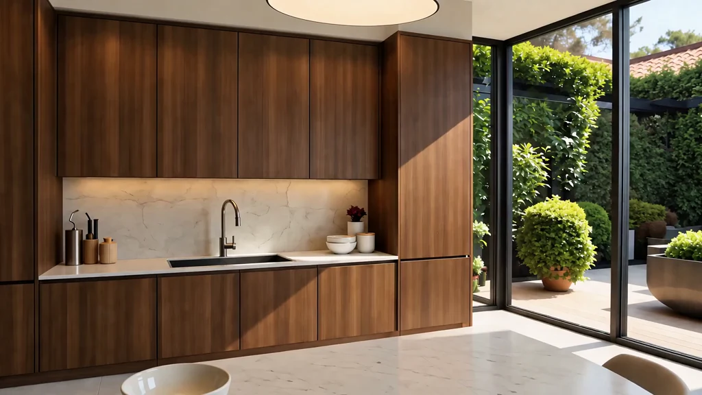
Decide which surface carries the most character. It may be a timber-grain cabinet, strongly patterned benchtop, coloured island or tiled splashback.
Let the other large surfaces support it. If cabinetry, benchtop and splashback all have strong movement or colour, none has enough quiet space to read clearly.
A useful hierarchy is:
one dominant field colour or material
one supporting surface
one smaller accent
Hardware and tapware are finishing details, not a reason to add another competing palette.
Compare undertones, not colour labels
Words such as white, beige, sage, charcoal and oak cover many undertones.
Compare samples directly:
Does the white lean blue, grey, cream or pink?
Does the timber read yellow, red, grey or neutral?
Does the stone pattern introduce a colour not repeated elsewhere?
Does the green become blue beside the floor?
Does black remain black or soften to charcoal under warm lighting?
Use physical samples from the actual product range. Screens, printers and edited photographs cannot reproduce colour reliably.
Test the room’s light throughout the day
Stand cabinet samples vertically because doors are vertical. Lay benchtop and flooring samples horizontally. View them together in morning, afternoon and at night under the proposed lighting.
Australian Government YourHome guidance notes that daylight can reduce artificial-light use, but direct sun on polished surfaces can cause glare. The direction of the windows, shading, cabinet sheen and benchtop finish all affect how colour is perceived.
Do not choose a darker colour from a bright showroom and assume it will behave the same in a south-facing or heavily shaded kitchen.
Warm neutrals
Warm off-whites, stone, mushroom and muted beige can connect a kitchen with timber, brick and soft furnishings. They are not automatically timeless; an undertone that conflicts with the floor can date the room immediately.
Use a large sample and compare it with true white, the existing wall and the proposed benchtop. The contrast helps reveal whether the colour reads calm, yellow, pink or grey in the home.
Muted greens and blues
Muted colour can give cabinetry identity without making every surface a feature. Green often relates well to timber and garden views; blue can sit comfortably with stone, white and warmer metals.
The restraint comes from limiting where the colour appears. A full tall bank, island or lower run can make more sense than splitting doors randomly. Repeat the colour or its undertone elsewhere in a controlled way.
Dark cabinetry
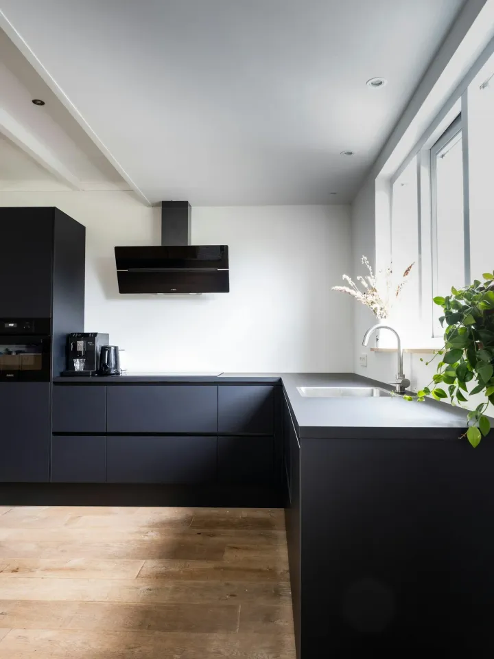
Charcoal, deep blue and near-black can anchor a room, but they change light, maintenance and visual weight.
Test fingerprints, dust and wiping marks on the exact finish. Check whether the room has enough useful task light and whether a large dark volume overwhelms adjacent spaces. A dark island can work differently from an entire wall of tall cabinetry.
Timber and timber-look finishes
Timber introduces grain as well as colour. Compare pattern scale, direction, repeat and edge detail—not only the tone of one sample.
Natural timber can vary between boards and change with age and light. Timber-look products have their own substrates, edge construction and pattern repeats. Ask for technical data, maintenance instructions and representative samples before treating either as a generic material.
Two-tone kitchens need a reason
Two colours can clarify the architecture when one defines the island, tall bank or lower cabinets. The split should relate to a volume or function.
Choose which colour leads and keep the second subordinate. Confirm how end panels, fillers, kickboards, bulkheads and integrated appliance panels are treated; those small junctions determine whether the scheme feels resolved.
Colour and sheen are one decision
The same colour can look different in matte, satin and gloss. Reflection can increase brightness and glare, reveal alignment or make a dark colour more demanding to clean. Matte can quiet reflection but may still show oily marks depending on the product.
Use the matte versus gloss cabinet guide to test the exact construction and cleaning method.
Build a full sample board
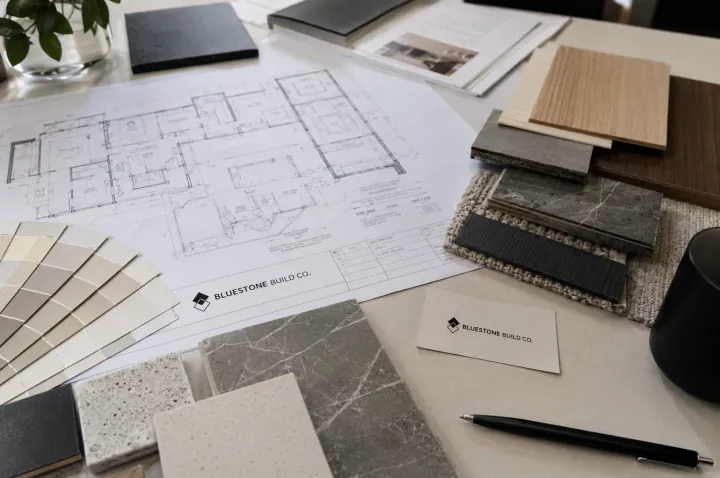
Collect the actual cabinet door, benchtop, splashback, flooring, paint, hardware and appliance finish. Arrange them in roughly the proportions they will occupy.
Then remove one material at a time. If the palette improves when a feature is removed, it was probably competing rather than contributing.
Keep approved sample codes and photographs with the specification. Supplier names, colour names, sheen, substrate and edge detail should be written down before ordering.
Kitchen colour checklist
Which existing materials must the new palette work with?
What is the dominant material or colour?
Do the undertones agree?
Have large samples been viewed vertically and horizontally as installed?
Has the palette been checked in morning, afternoon and artificial light?
Does the finish suit fingerprints, cleaning and glare?
Are colour, sheen, substrate and edges recorded in the specification?
Where Bluestone fits
Bluestone coordinates colour with layout, lighting, material construction and the rooms around the kitchen. The palette is signed off as a complete set, not as disconnected samples.
See Bluestone’s approach to complete kitchen renovations in Melbourne.